Secret War Journal[3 April 2013]
Disclaimer: This is a quote from an article "Improve Your Dining Area". I do not claim credit for this post. Please credit the original author when quoting for personal usage.
By Quek Zhanquan
Pay Attention to Colours
There are a number (of) studies on the effect of colours and how they affect people. These findings can be well-applied in the dining area. Consider introducing these hues into your dining area, on the walls, furniture, lighting, linen and tableware. Contrast the colours of your furniture with the walls, or use different tones of the same colour for a dash of style.
Notice that many picture perfect dining areas are cream coloured? This is because the gentle hue is soothing and creates a relaxing atmosphere while easing the appetite. It is also advisable to employ warm, earthy tones like beige and brown, which can clam the system when enjoying a meal.

Yellow is a sociable hue and stimulates conversation over the dining table, but it has to be carefully matched with the lighting as it can result in a nasty shade of green in the wrong light.

Red is believed to be an appetite stimulant and a colour that increases metabolism but refrain from using too much as it is associated with agression.

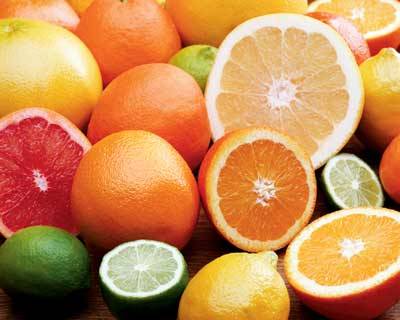
Orange is believed to improve appetites and aid digestion, but refrain from using it to a major extent, like having orange walls. It can, however, be used in different shades like peach and apricot, and on smaller things like napkins, table cloths and table decoration.

Warm colours like gold create an inviting look and can add a touch of splendour to your dining area. Combined with lighting or candlelight, gold creates a warm glow against the walls. Purple is a very rare colour in nature and can cause things to look artificial, but when used tastefully, it can convey opulence and make your dining area look one of a kind. Finally, avoid blue and shades of pink and violet because they repress appetites. Besides the aforementioned colours, the popular hues used for dining areas are creamy or golden yellow, wine, dusty rose, burgundy and terracotta.
Food Colours
Green and brown are common and appetising food colours, whereas blue is well-known as the least appetising hue. Since olden times, people have instinctively learned to avoid food that appeared toxic or spoiled, often identified by its blue, black or purple colours.
Blue is an extremely rare colour in food - there are no blue vegetables or meat. In fact, experiments showed that food dyed blue can test subjects to lose their appetite. On a lighter note, consider using a blue light bulb in your dining area or have your food on a blue plate if you're on a diet.
In summary
"A crust eaten in peace is better than a banquet partaken in anxiety." - Aesop
Disclaimer: This is a quote from an article "Improve Your Dining Area". I do not claim credit for this post. Please credit the original author when quoting for personal usage.
By Quek Zhanquan
Pay Attention to Colours
There are a number (of) studies on the effect of colours and how they affect people. These findings can be well-applied in the dining area. Consider introducing these hues into your dining area, on the walls, furniture, lighting, linen and tableware. Contrast the colours of your furniture with the walls, or use different tones of the same colour for a dash of style.
Notice that many picture perfect dining areas are cream coloured? This is because the gentle hue is soothing and creates a relaxing atmosphere while easing the appetite. It is also advisable to employ warm, earthy tones like beige and brown, which can clam the system when enjoying a meal.
Yellow is a sociable hue and stimulates conversation over the dining table, but it has to be carefully matched with the lighting as it can result in a nasty shade of green in the wrong light.

Red is believed to be an appetite stimulant and a colour that increases metabolism but refrain from using too much as it is associated with agression.
Orange is believed to improve appetites and aid digestion, but refrain from using it to a major extent, like having orange walls. It can, however, be used in different shades like peach and apricot, and on smaller things like napkins, table cloths and table decoration.
Warm colours like gold create an inviting look and can add a touch of splendour to your dining area. Combined with lighting or candlelight, gold creates a warm glow against the walls. Purple is a very rare colour in nature and can cause things to look artificial, but when used tastefully, it can convey opulence and make your dining area look one of a kind. Finally, avoid blue and shades of pink and violet because they repress appetites. Besides the aforementioned colours, the popular hues used for dining areas are creamy or golden yellow, wine, dusty rose, burgundy and terracotta.
Food Colours
Green and brown are common and appetising food colours, whereas blue is well-known as the least appetising hue. Since olden times, people have instinctively learned to avoid food that appeared toxic or spoiled, often identified by its blue, black or purple colours.
Blue is an extremely rare colour in food - there are no blue vegetables or meat. In fact, experiments showed that food dyed blue can test subjects to lose their appetite. On a lighter note, consider using a blue light bulb in your dining area or have your food on a blue plate if you're on a diet.
In summary
- Cream coloured hues is soothing, relaxing and improves appetite
- Warm, earthy tones (e.g. Beige, brown) calm the system
- Green and brown are common appetising colours
- Yellow is a sociable hue; stimulates conversation
- Red improves appetite and increases metabolism
- Orange improves appetite and digestion
- Blue, pink, purple, black repress appetite
"A crust eaten in peace is better than a banquet partaken in anxiety." - Aesop

0 comments:
Post a Comment